Dynamic Content
Klaviyo's Email Builder Feature
OVERVIEW
One of the main advantages of Klaviyo as a messaging platform is its ability to include message content that can be customized for each individual recipient, even when working at scale.
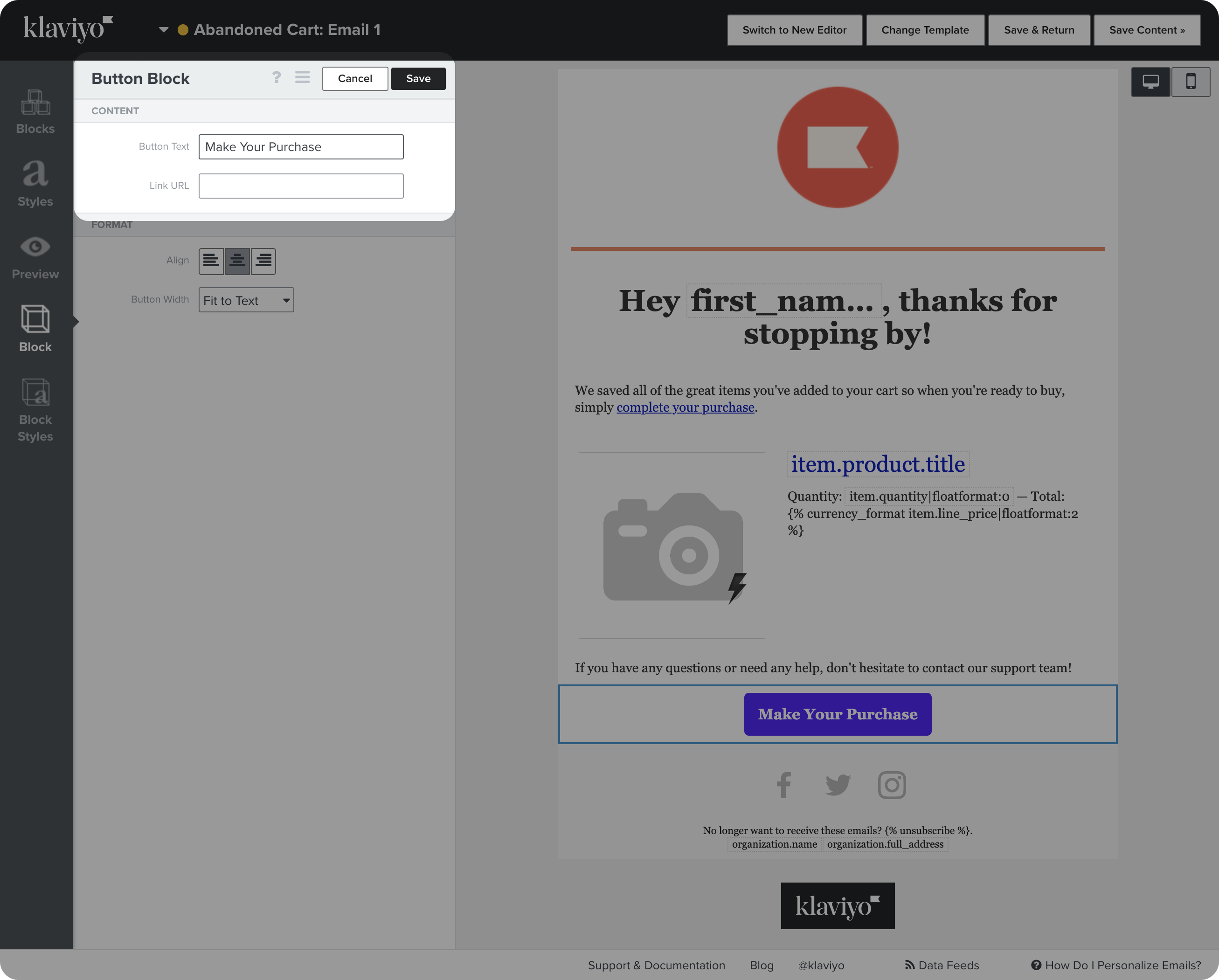
While many templates include recommended dynamic content, it is often presented as pieces of code between "{ }" symbols.
This project aimed to redesign how dynamic content is inserted and presented across the platform, with an emphasis on usability and extending to a wide range of use cases.
ABOUT
Web email builder feature
ROLE
User Experience, User Interface
TEAM
Product • Juan Castaño, Corrine Lin
Design • Gui Schmitt
Engineering • Lindsey Curran, Nikita Shenkman, Daniel Kezerashvili
THE PROBLEM
THE PROBLEM
Code-centric approach was hard to understand and inhibited creativity
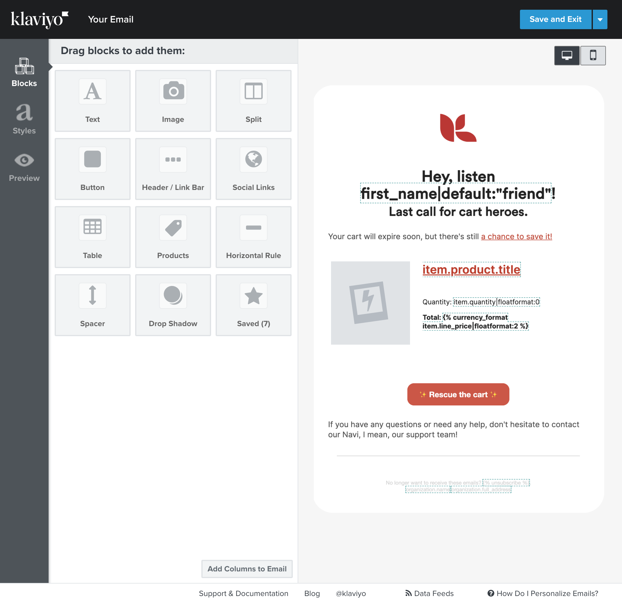
The classic editor used special snippets of code in brackets (like {{ first_name}} ) that rendered dynamic content on send.
While technically inclined users were OK handling code, we got insights from research that most users had difficulty understanding what each piece of code meant and were uncomfortable using it.
Fearing they would "mess things up" or “break it”, users were less inclined to modify our templates to express their brand.
Some of our most popular templates, like abandoned cart emails, had a considerable amount of the message showing as code on the email builder.
We encouraged users to create sophisticated automated sending strategies - specialized messages for different segments of an audience. For example, changing a message based on the cost of items left in a cart, or how frequent of a buyer someone was.
While strategizing this way provided great results, it created a lot of work in the future to maintain consistency across email messages.
Best-practices were unclear
Users were relying on external help documents to learn about essential best practices such as the inclusion of fallback language to avoid weird empty spaces in a sentence (in case the recipient didn't have a “last name” on the database) and other data modifiers that can ensure consistency (for example, forcing that all first names are capitalized adequately in a sentence).
The guide for dynamic content was in the top 5 of the most visited articles in the help center.
Most easily accessible resources on mobile UX patterns provide a catalog approach, showcasing examples of patterns with little to no contextual information on their strengths, best uses, and weaknesses. The tool should provide users with enough relevant context to make informed design decisions, regardless of their expertise.
Users didn't know where dynamic content could be used
While Klaviyo content builders featured a basic picker to insert dynamic content, many popular use cases for dynamic content didn’t feature any indicator.
Users were unaware about the ability to personalize the subject line of an email or the label in a button. Klaviyo needed a standardized insertion method for dynamic content, ideally aware of the context of use.
Most easily accessible resources on mobile UX patterns provide a catalog approach, showcasing examples of patterns with little to no contextual information on their strengths, best uses, and weaknesses. The tool should provide users with enough relevant context to make informed design decisions, regardless of their expertise.
How might we...
optimize the use of dynamic content in Klaviyo, empowering users to efficiently create customized messages on a large scale?
Process
Process
Research
Research
We started with an analysis of competitors and other consumer products that have similar capabilities in handling picking content that can change after the fact, depending on certain circumstances.
Our competitor research revealed that synced content was rarely found in email editors.
To gain further insight, I looked beyond email and searched for patterns used in mass market website builders (which, like email, have shared elements across pages) and other creative tools that incorporate a similar concept of visually editable elements across multiple places (e.g. Symbols in Sketch and Components on Figma).
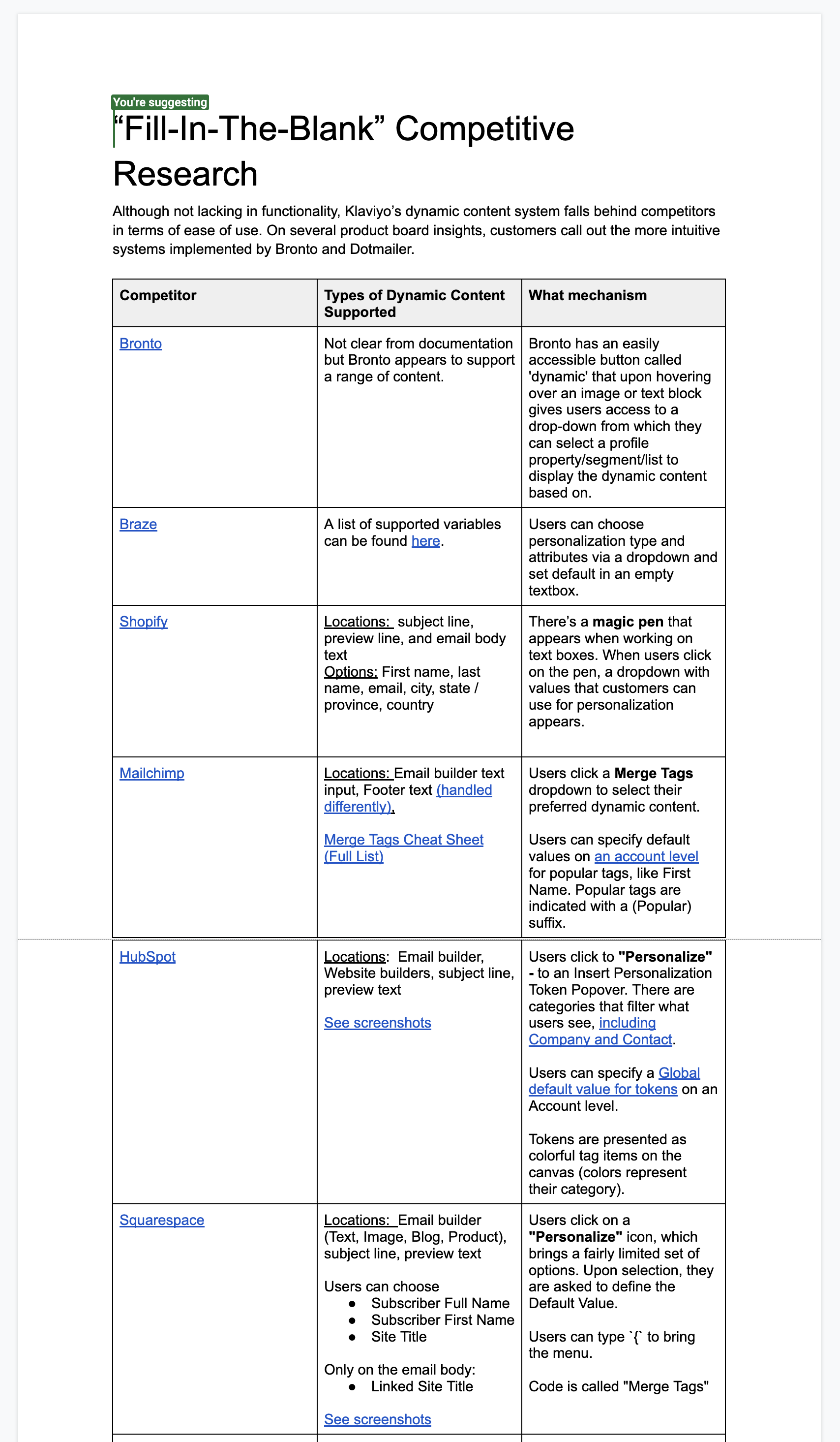
Feature was seen across competitors, but few had an intuitive experience (lots of code exposed)
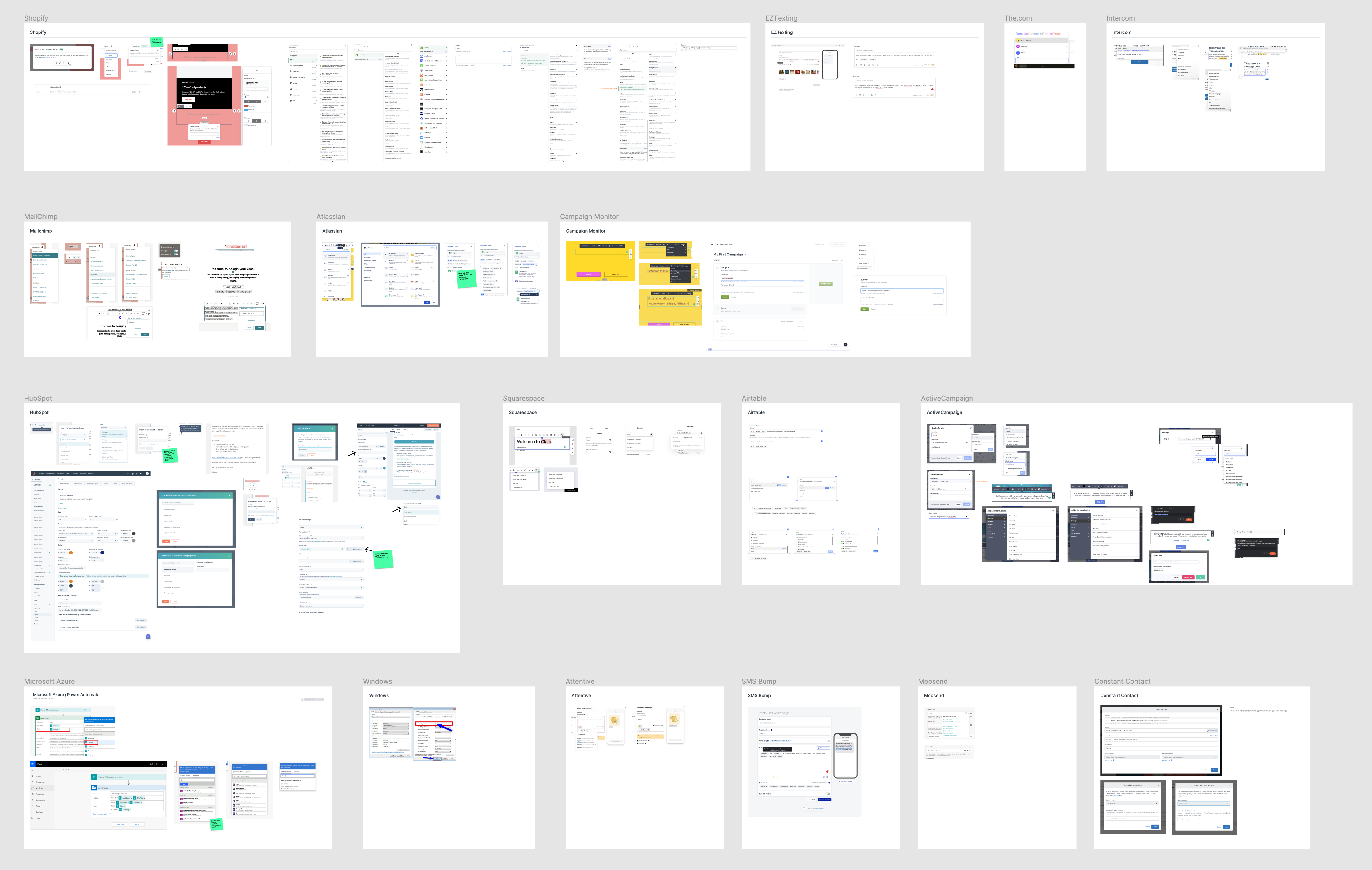
Research on web apps that had some level of dynamic content / stylization.
Good examples were seen in platforms like HubSpot and Airtable.
Research highlights
Platforms with a large catalog of items to choose from have success showing some hierarchy or categorization to help users find what they want.
Most platforms do not expose a fallback/default value and still rely on code on the canvas, despite its usability shortcomings.
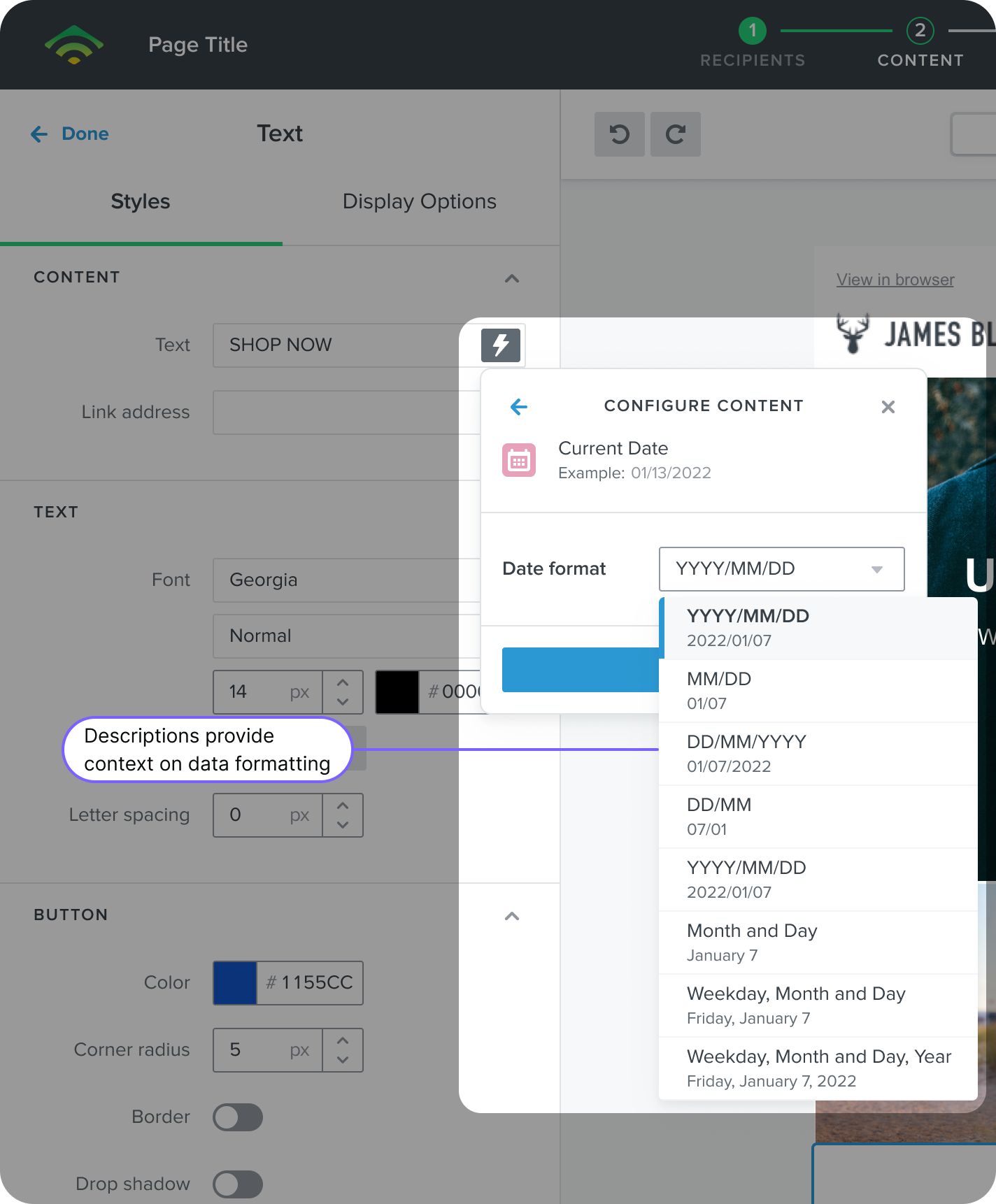
Contextualizing the data with samples or a clear statement of what will occur in certain scenarios (for fallback data) elevates users’ confidence that they are selecting the right item.
Hubspot's approach to account-level default value ensures brands can stay consistent in their communication, regardless of who is writing the email (for example, having “friend” as a fallback for First Name)
Iterations
To set scope we partnered with stakeholders in Product to vote on features that we believed were important to include for the initial release and those that should be handled in subsequent releases.
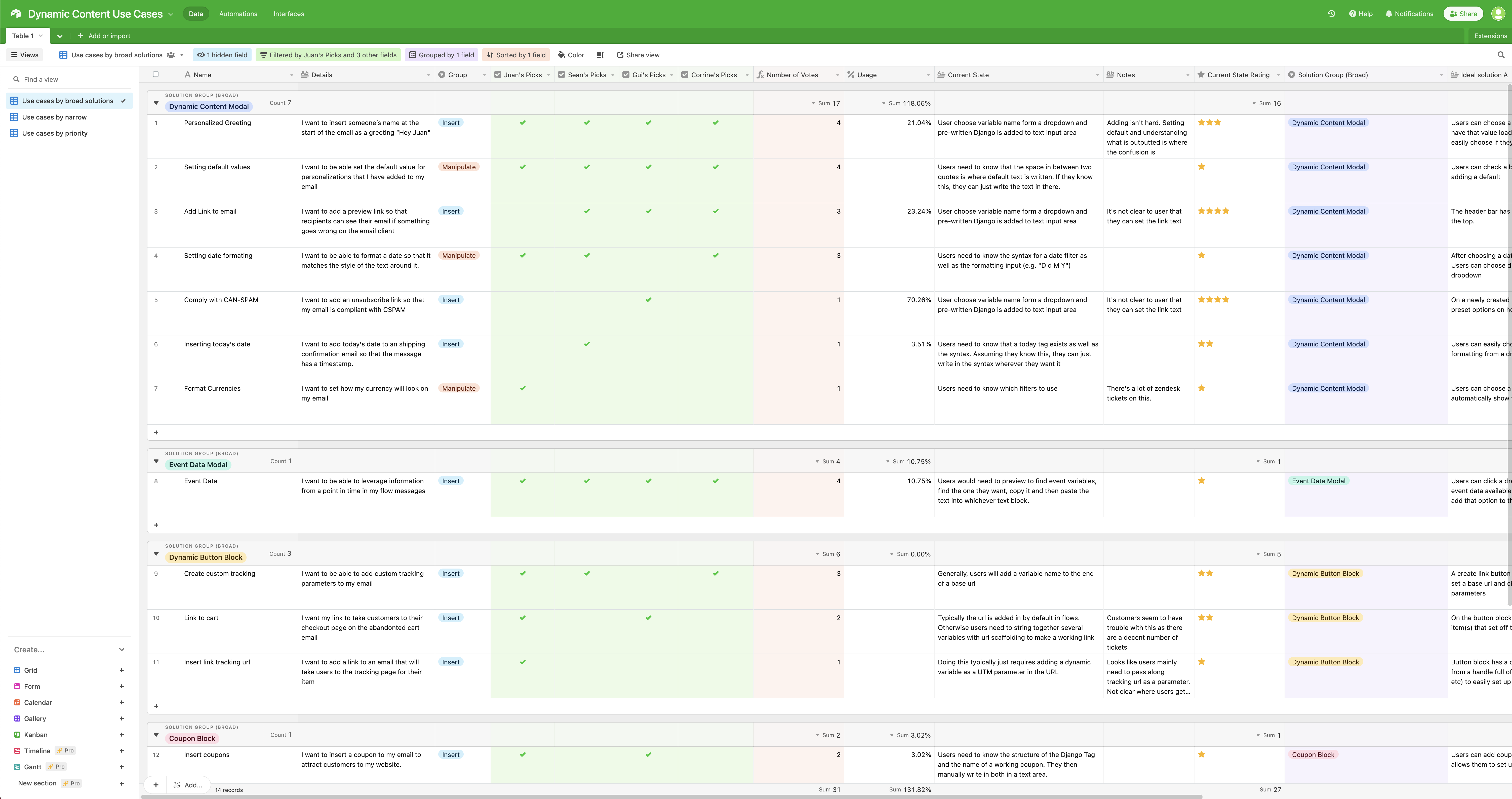
I explored a wide range of options for how we should showcase the insertion experience, including menus and display options.
Additionally, I focused on how different categories could be displayed and how we could offer some preferences that would be applied to any given piece of dynamic content.
When bringing some of the iterations from wireframes to a mock state using our design system components, I explored how the feature set we wanted could be accomplished with modals, dropdowns and segmented controls.
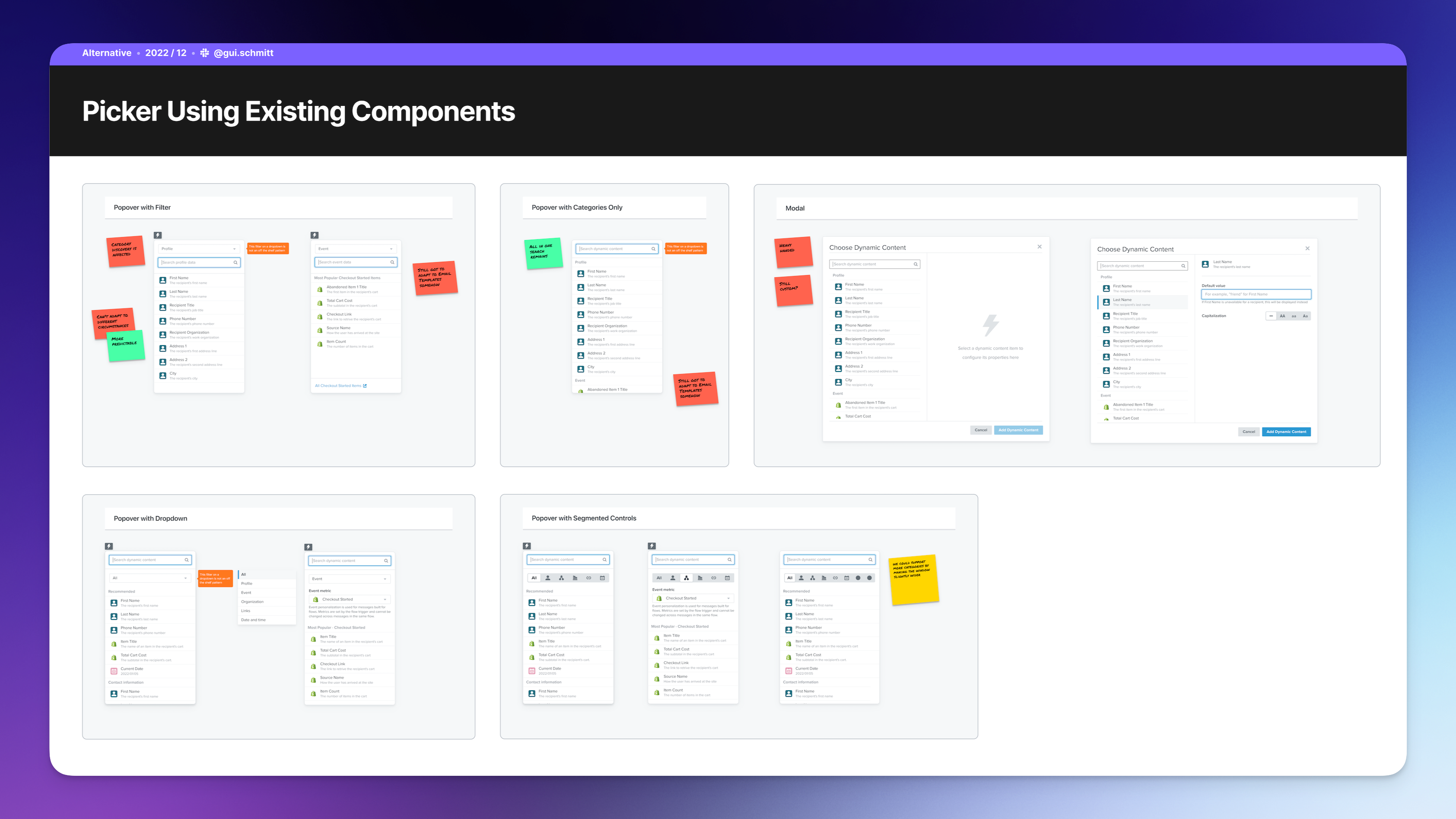
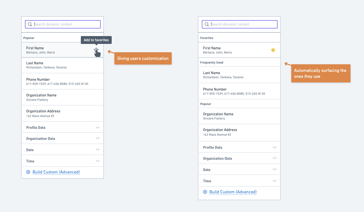
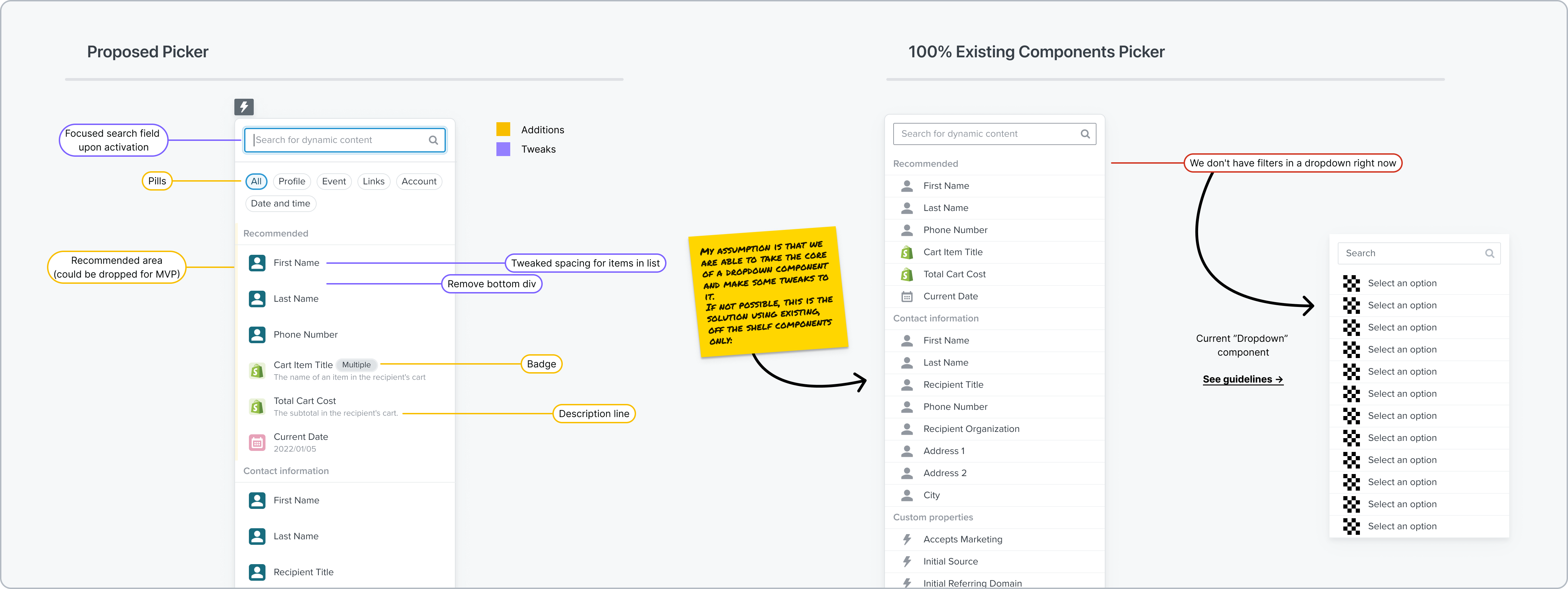
From that initial exploration, we had an assumption that exposing the data categories users directly in the UI (using “pill buttons”) was important for both new users trying to get a sense of what is possible and advanced users that want to quickly find something specific.
To validate our assumptions on this space and get some early responses on how users felt about this direction, we performed user validation tests using prototypes in Figma - one with a pill buttons for filters and another one using standard dropdown components.
Main takeaways
Users overwhelmingly preferred the new pill element over the dropdown, validating our assumption that it should be proposed as a new design system component.
For some items that were considered self-explanatory (such as "First Name - The recipient's first name"), the description line did not provide value and could be removed to improve the list's scannability. However, the description was still helpful for providing context on data coming from other sources (like Shopify) and other extreme use cases.
Stakeholders felt that our recommendations (listed first when users bring the selector) could use an additional visual differentiator to stand out from other options in the dropdown.
Solution
Solution
Discoverability and
first-time use
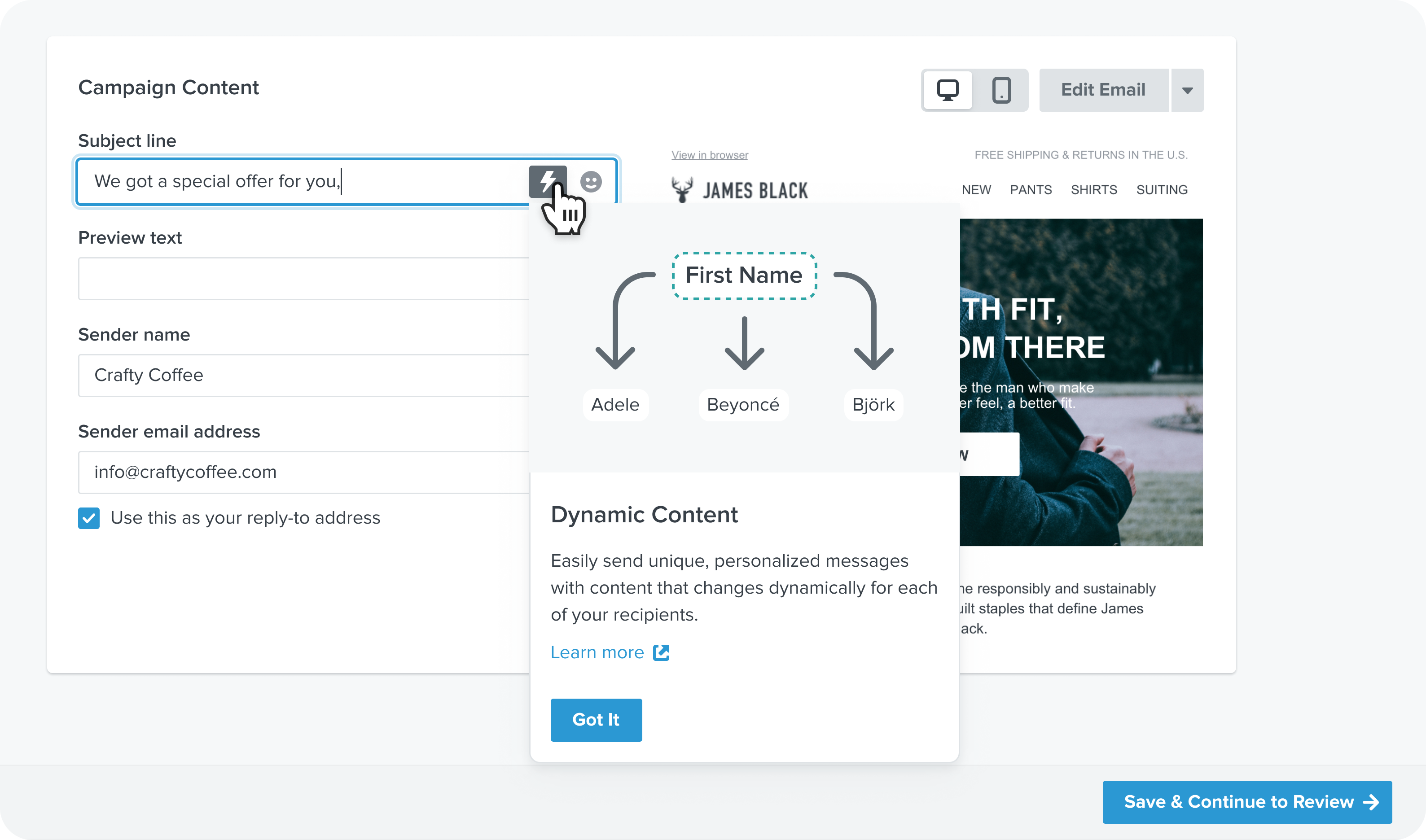
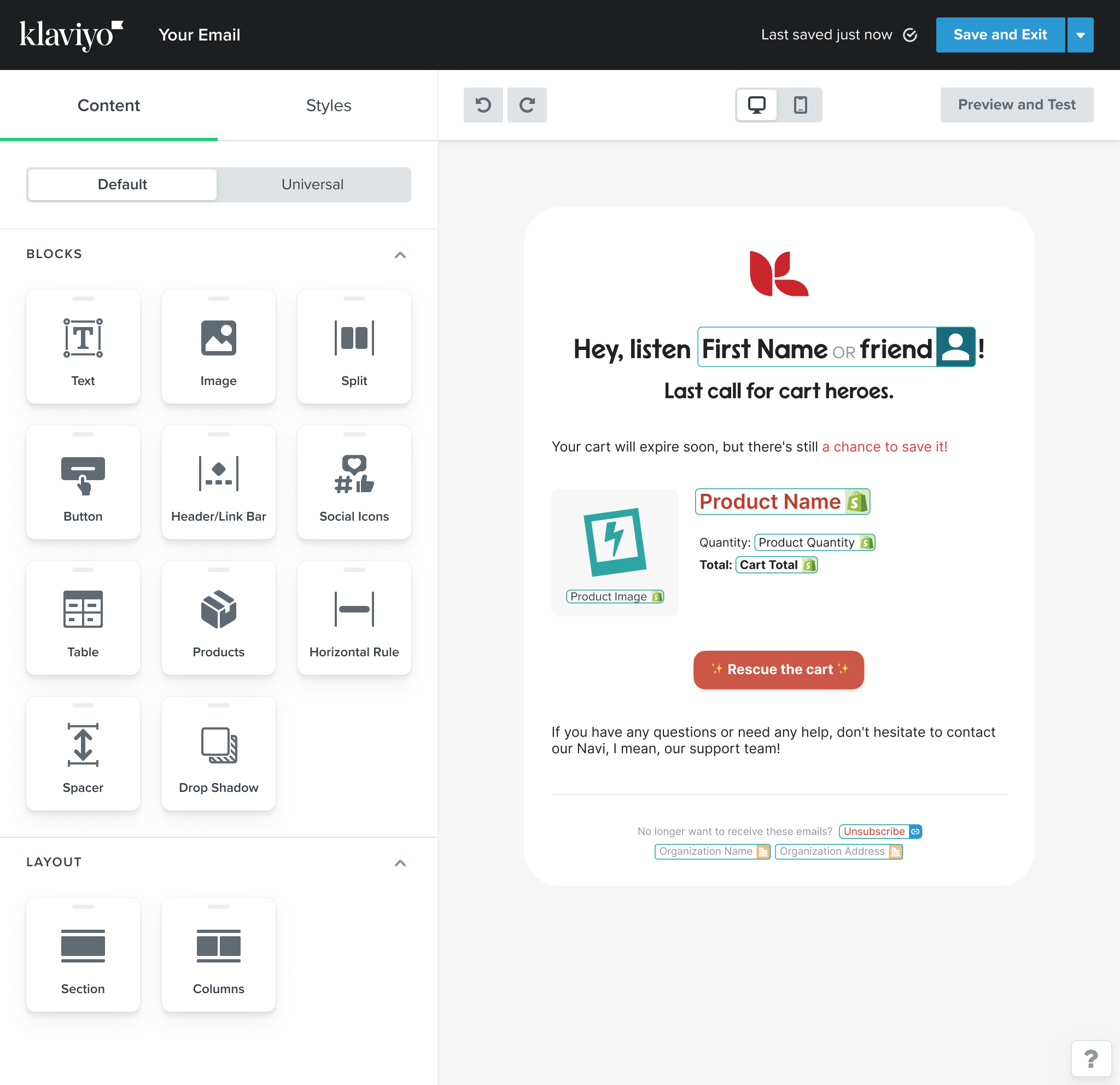
A bolt symbol is added on focus to all fields that support dynamic content.
The first time a user chooses to insert dynamic content or interacts with existing dynamic content on a field, a dialog contextualizes the feature and offers additional resources in case they'd like to learn more.
The interface for editing universal content has been modified with a special green header, emphasizing its new state and the effects of editing the content which will update in multiple locations.
The header highlights how many other messages also use universal content. Users can still view the context of the original message, but with reduced opacity to avoid confusion.
Selecting an item
Selecting an item
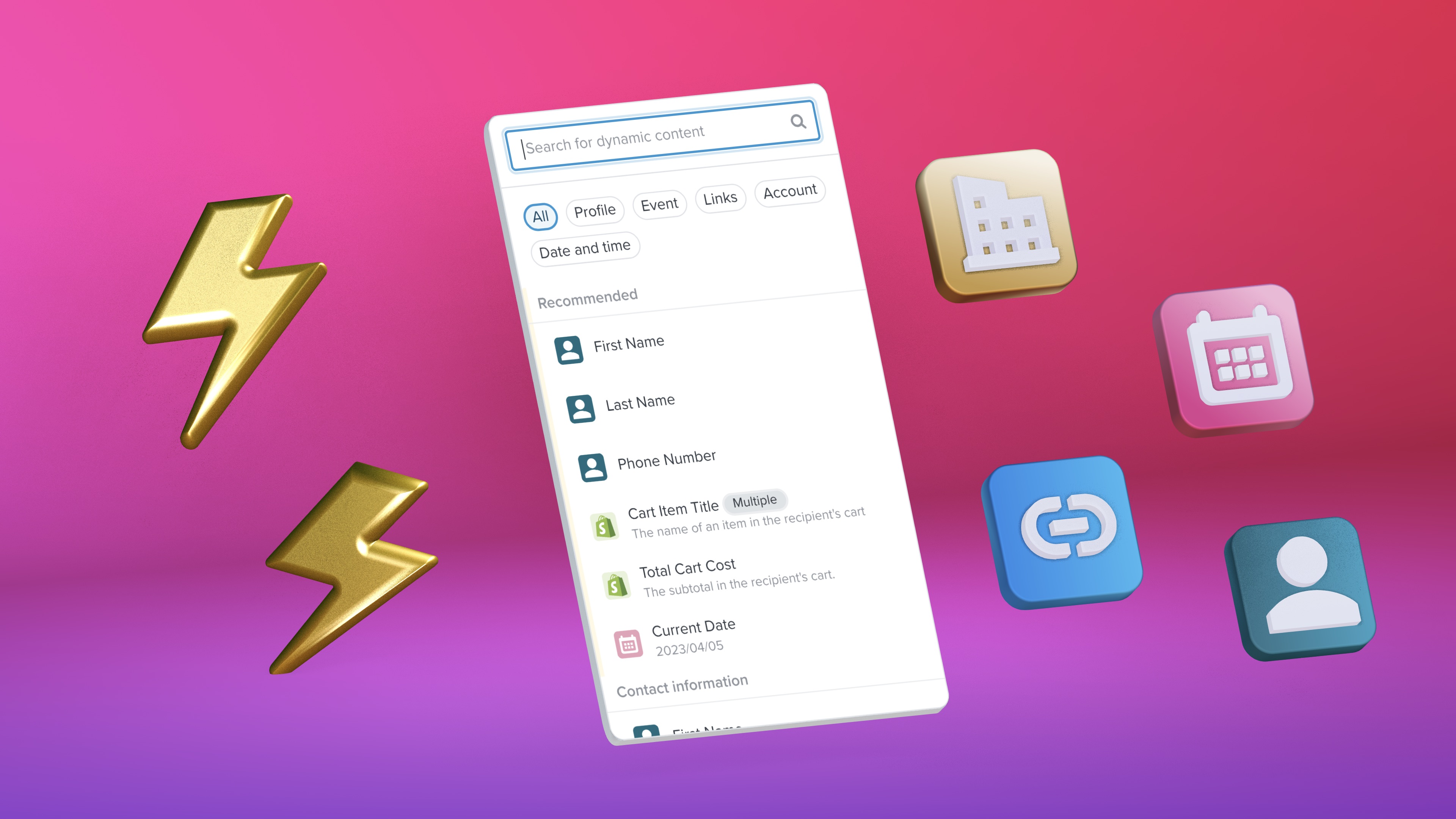
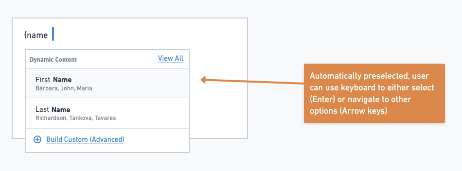
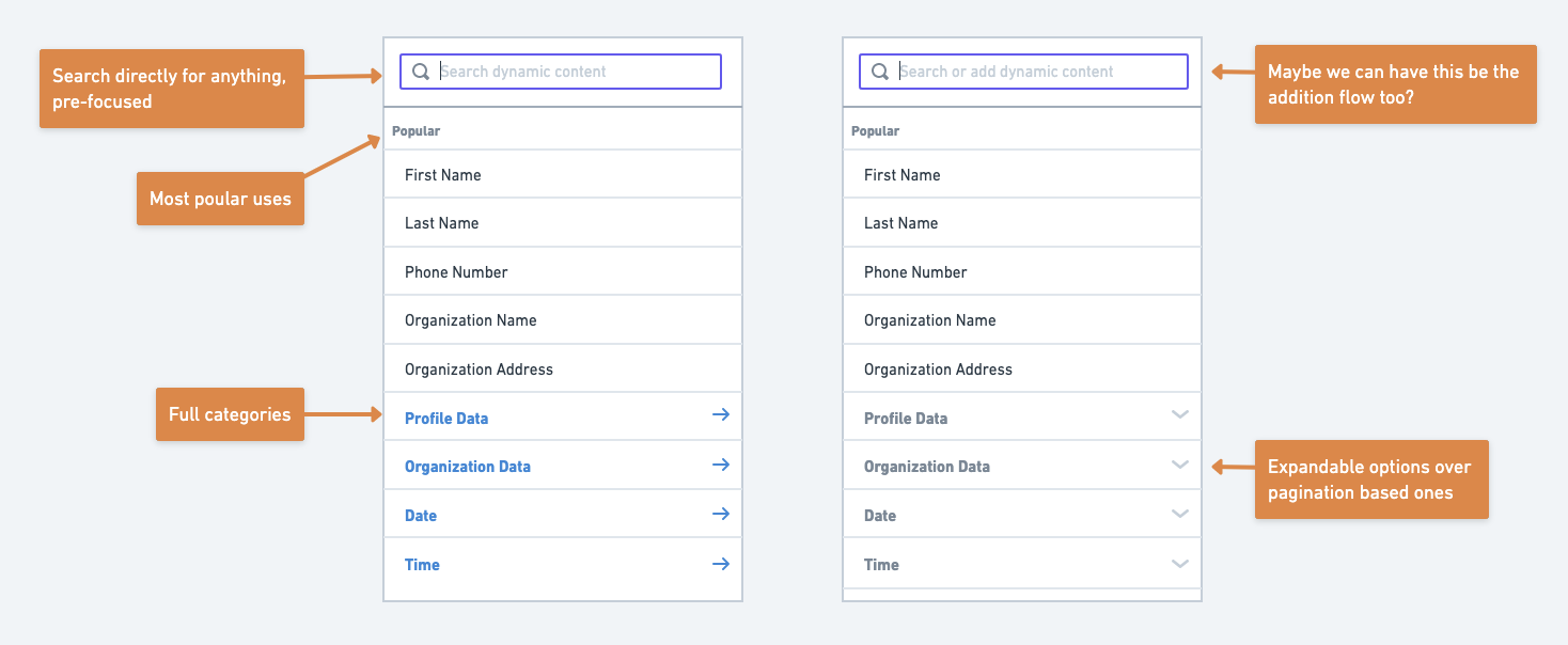
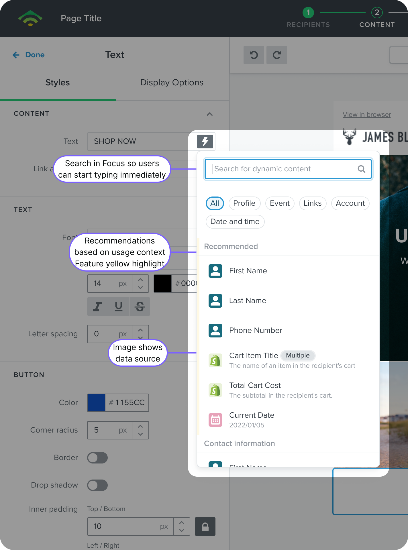
A popover menu visually exposes dynamic data that users can use in their messages.
It uses the context, such as the goal of the automation, to provide recommendations for which data users should use.
We use the context of the field, commonly used items, and the message goal (campaign vs automation) to inform what gets recommendated.
Users can also find what they're looking for by using the pre-selected search field or category filters.
If mistakes were made, users are given clear options to discard changes and can see the impact of how many messages will get an update after confirming edits to the universal content.
If mistakes were made, users are given clear options to discard changes and can see the impact of how many messages will get an update after confirming edits to the universal content.
A popover menu visually exposes dynamic data that users can use in their messages.
It uses the context, such as the goal of the automation, to provide recommendations for which data users should use.
We use the context of the field, commonly used items, and the message goal (campaign vs automation) to inform what gets recommendated.
Users can also find what they're looking for by using the pre-selected search field or category filters.
Configuring options
Configuring options
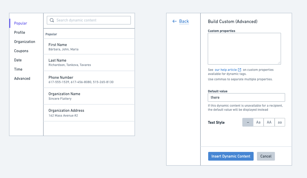
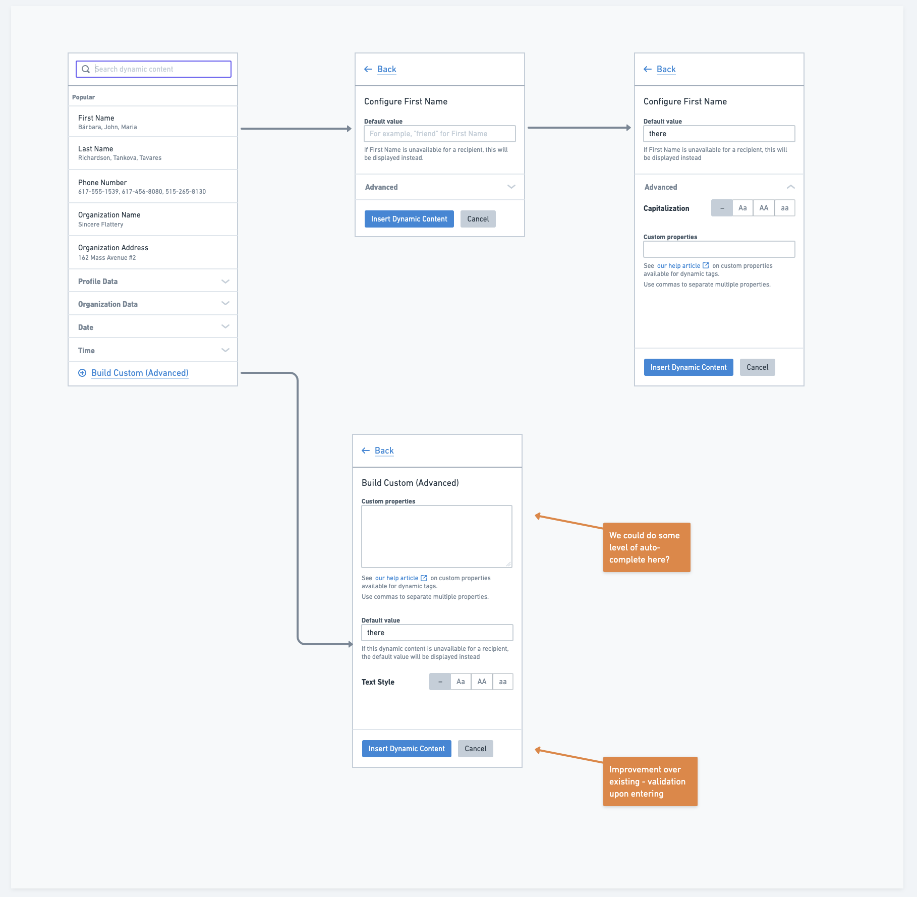
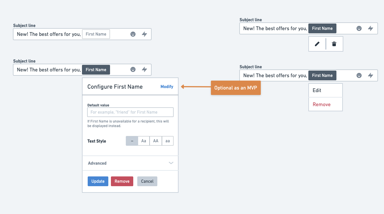
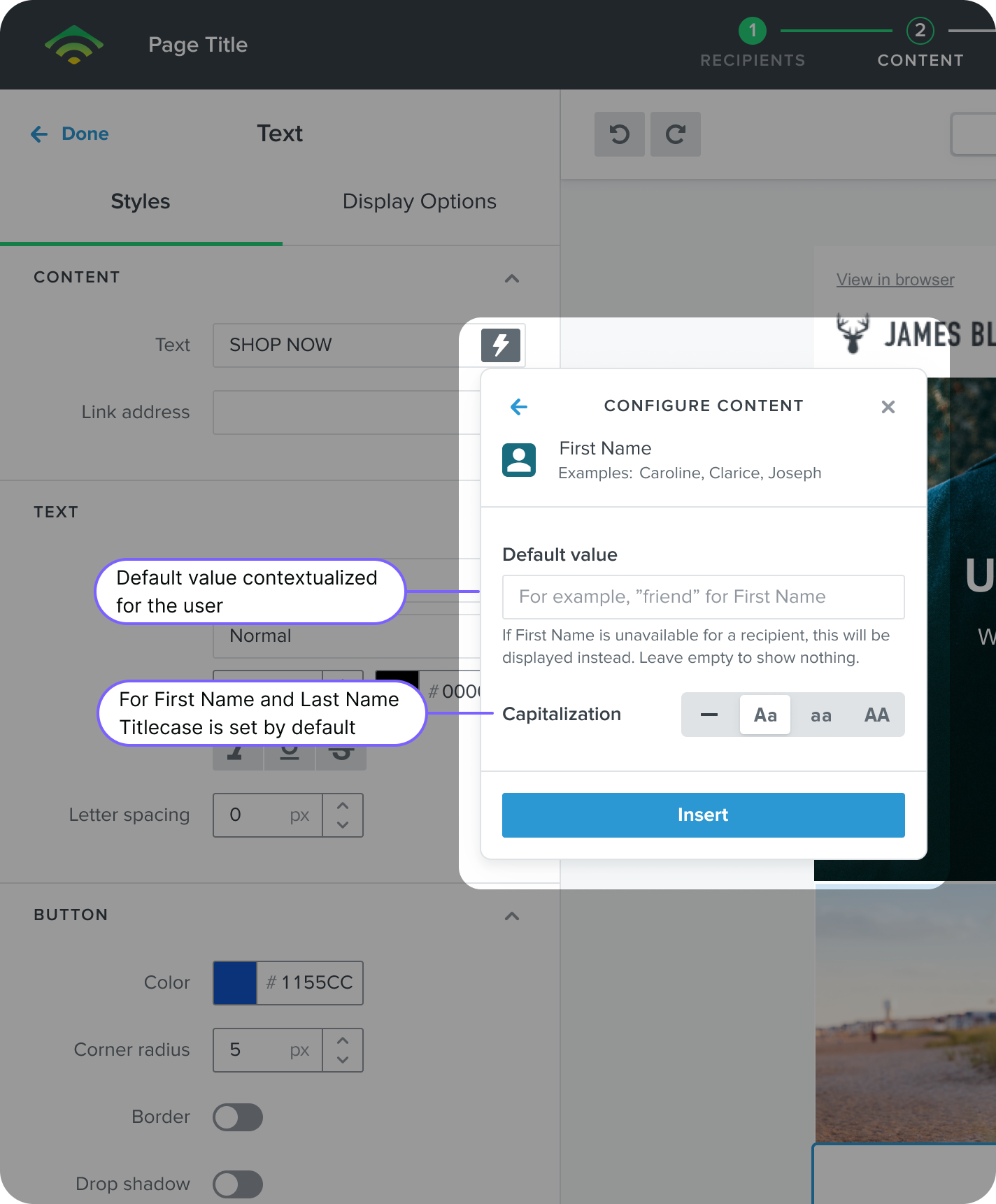
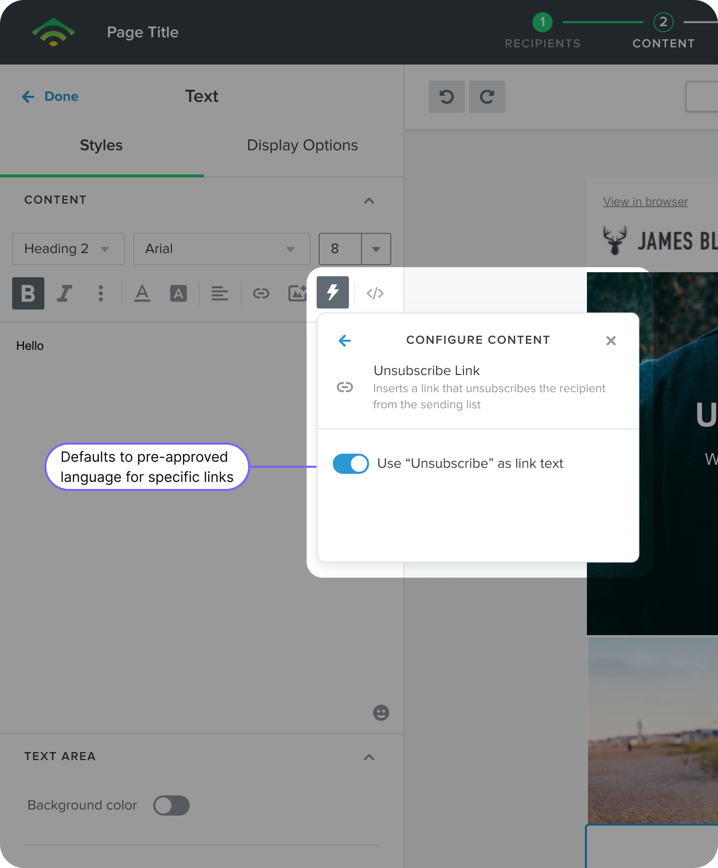
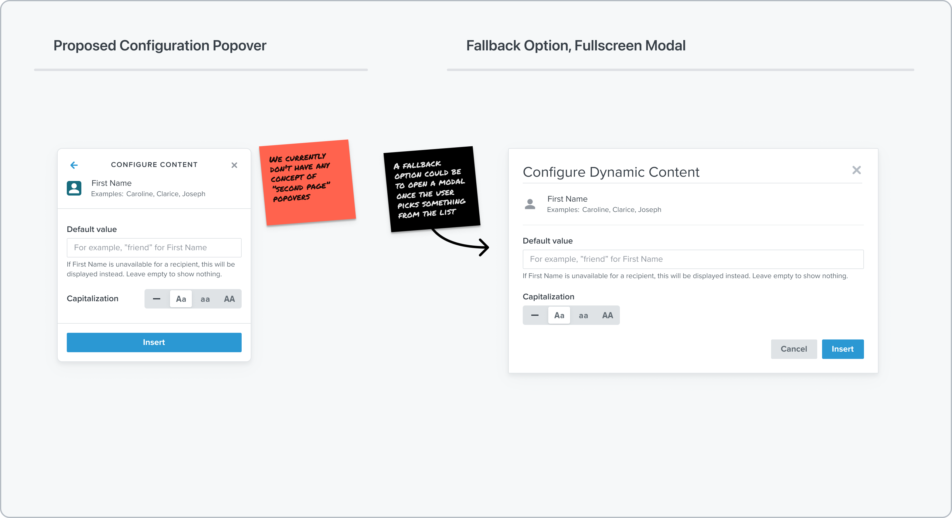
Once the user selects an item, context is provided about the need to include a fallback.
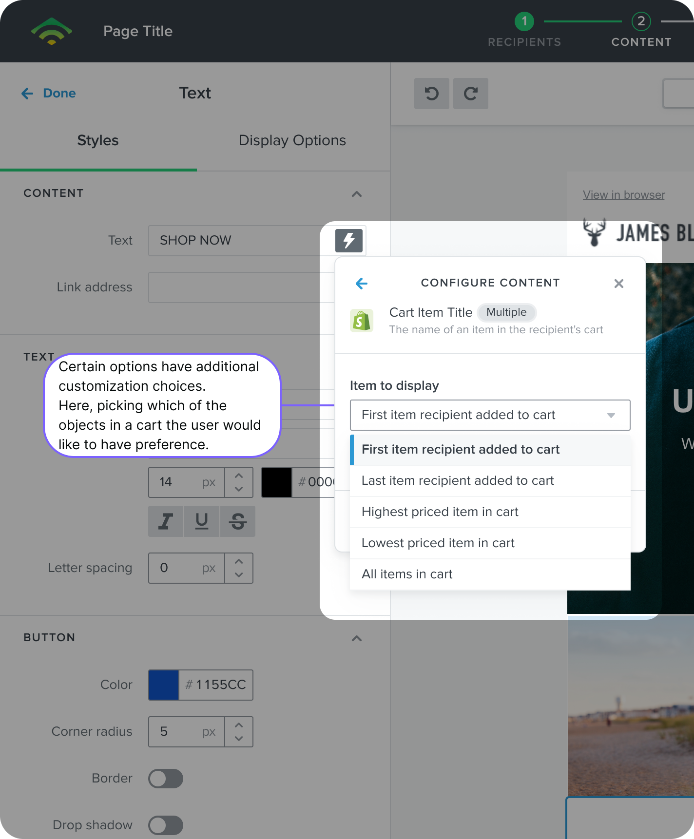
Certain popular uses of data from e-commerce platforms can have special controls, like choosing what item from an abandoned cart the user would like to select, based on preferred criteria.
If mistakes were made, users are given clear options to discard changes and can see the impact of how many messages will get an update after confirming edits to the universal content.
If mistakes were made, users are given clear options to discard changes and can see the impact of how many messages will get an update after confirming edits to the universal content.
Once the user selects an item, context is provided about the need to include a fallback.
Certain popular uses of data from e-commerce platforms can have special controls, like choosing what item from an abandoned cart the user would like to select, based on preferred criteria.
Improving usability by eliminating code
Configuring options
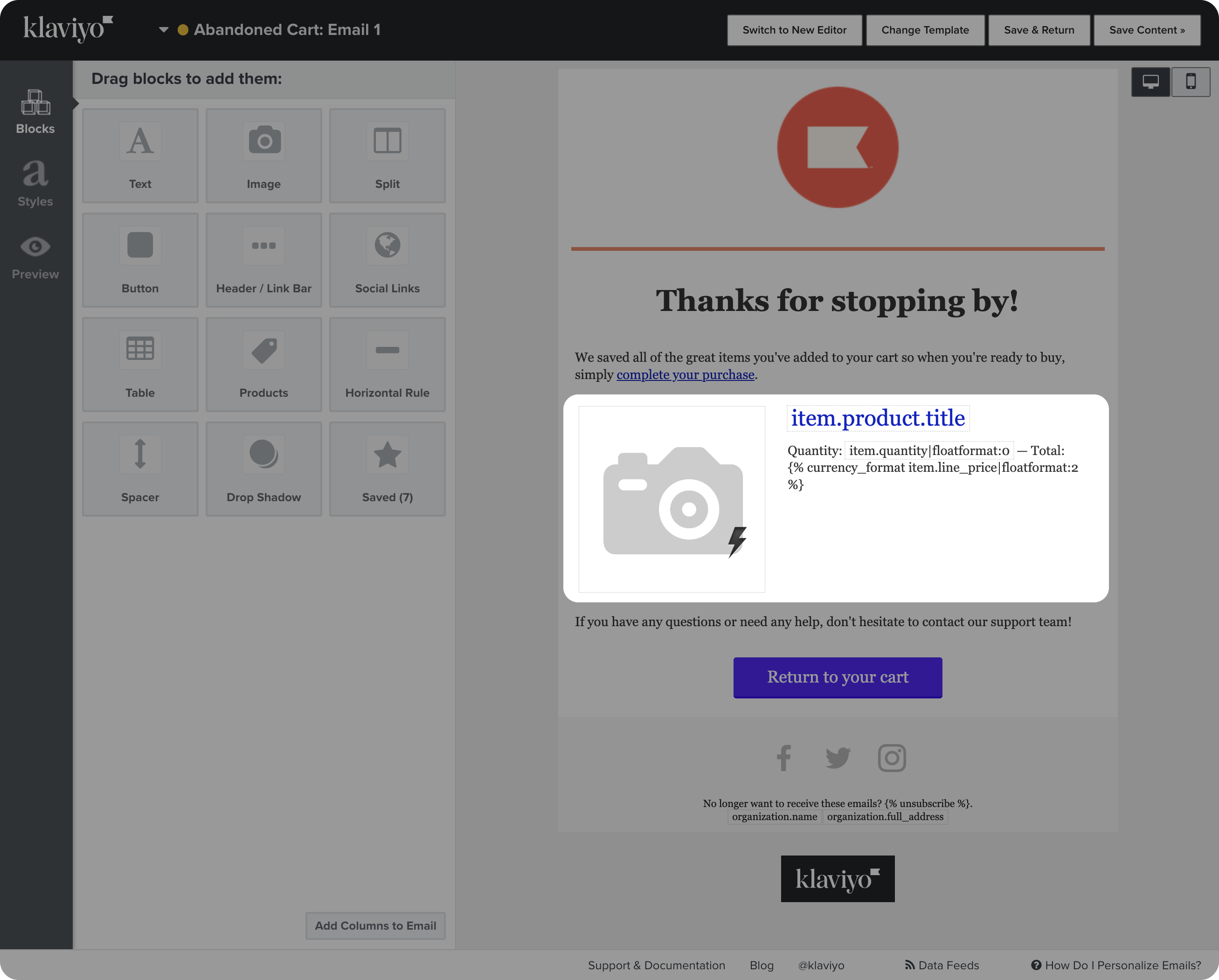
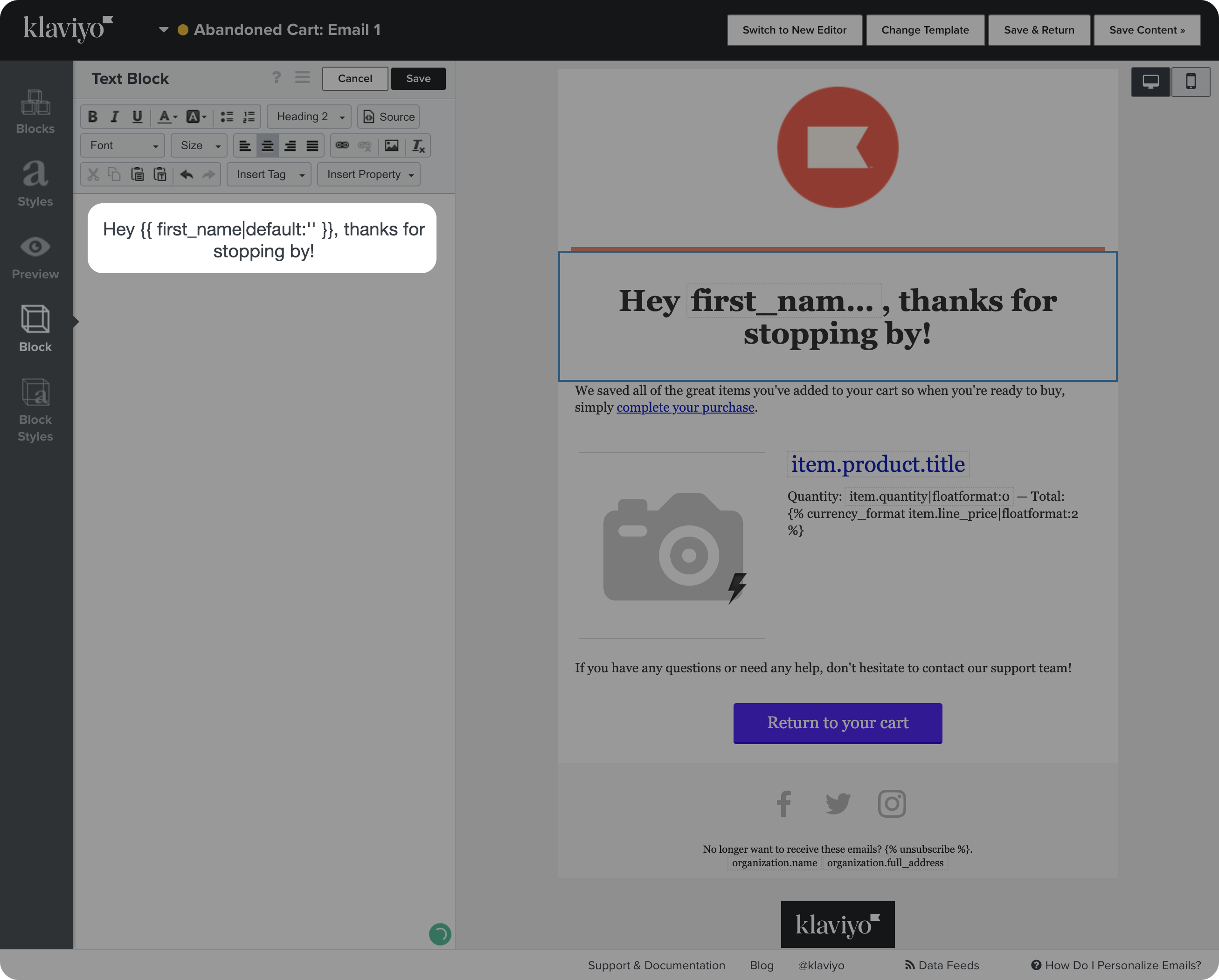
After insertion, the title of the dynamic data is presented as a visual tag on the field.
Users can hover to see more details or click on the element to edit the configurations of the dynamic content
If mistakes were made, users are given clear options to discard changes and can see the impact of how many messages will get an update after confirming edits to the universal content.
If mistakes were made, users are given clear options to discard changes and can see the impact of how many messages will get an update after confirming edits to the universal content.
Once the user selects an item, context is provided about the need to include a fallback.
Certain popular uses of data from e-commerce platforms can have special controls, like choosing what item from an abandoned cart the user would like to select, based on preferred criteria.
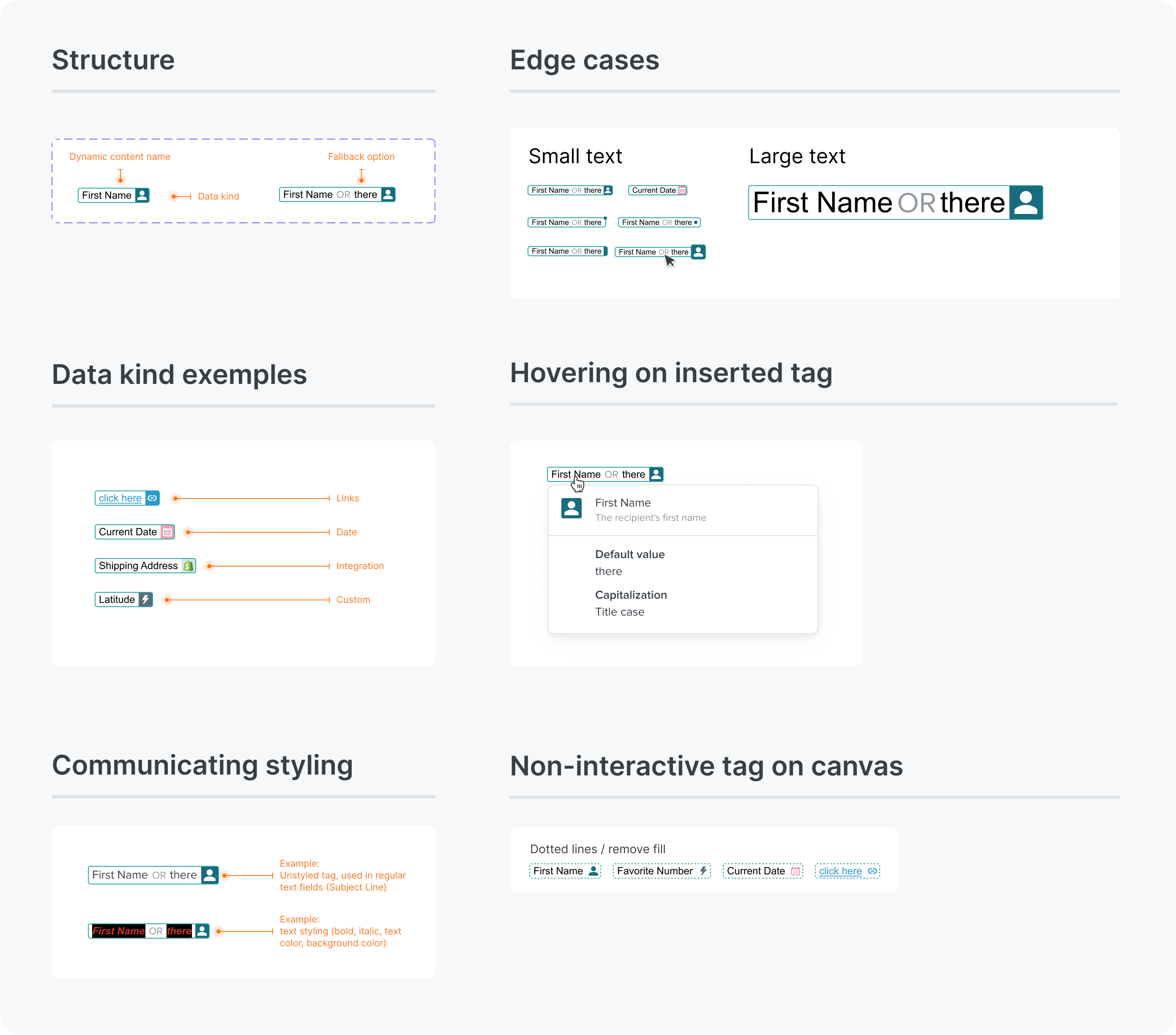
Since dynamic text can be stylized if included in an email body for example, it was an important consideration for the visual tag to represent added styling.
Improving the design system vs MVP version
Configuring options
Our ideal solution used pill toggles to filter sections, but that was not a component available in the Design System at the time.
I worked with the Design Systems team to guide the implementation of the component while providing a version that utilized 100% off-the-shelf components that were available at the time.
If mistakes were made, users are given clear options to discard changes and can see the impact of how many messages will get an update after confirming edits to the universal content.
If mistakes were made, users are given clear options to discard changes and can see the impact of how many messages will get an update after confirming edits to the universal content.
Once the user selects an item, context is provided about the need to include a fallback.
Certain popular uses of data from e-commerce platforms can have special controls, like choosing what item from an abandoned cart the user would like to select, based on preferred criteria.
While compromised, the MVP version would allow us to deliver value faster and fix this major usability challenge in our platform.
If mistakes were made, users are given clear options to discard changes and can see the impact of how many messages will get an update after confirming edits to the universal content.
If mistakes were made, users are given clear options to discard changes and can see the impact of how many messages will get an update after confirming edits to the universal content.
Once the user selects an item, context is provided about the need to include a fallback.
Certain popular uses of data from e-commerce platforms can have special controls, like choosing what item from an abandoned cart the user would like to select, based on preferred criteria.


links & hobbies
links & hobbies
links & hobbies
links & hobbies
links & hobbies
Photography ∙ Playlists ∙ Films
hey, thanks for visiting
hey, thanks for visiting
hey, thanks for visiting
hey, thanks for visiting
hey, thanks for visiting
have a nice day
have a nice day
have a nice day
have a nice day
have a nice day
PIXELS POLISHED WITH ♥, BY GUI ∙ LAST UPDATED EARLY 2023